Cáz

Cádiz

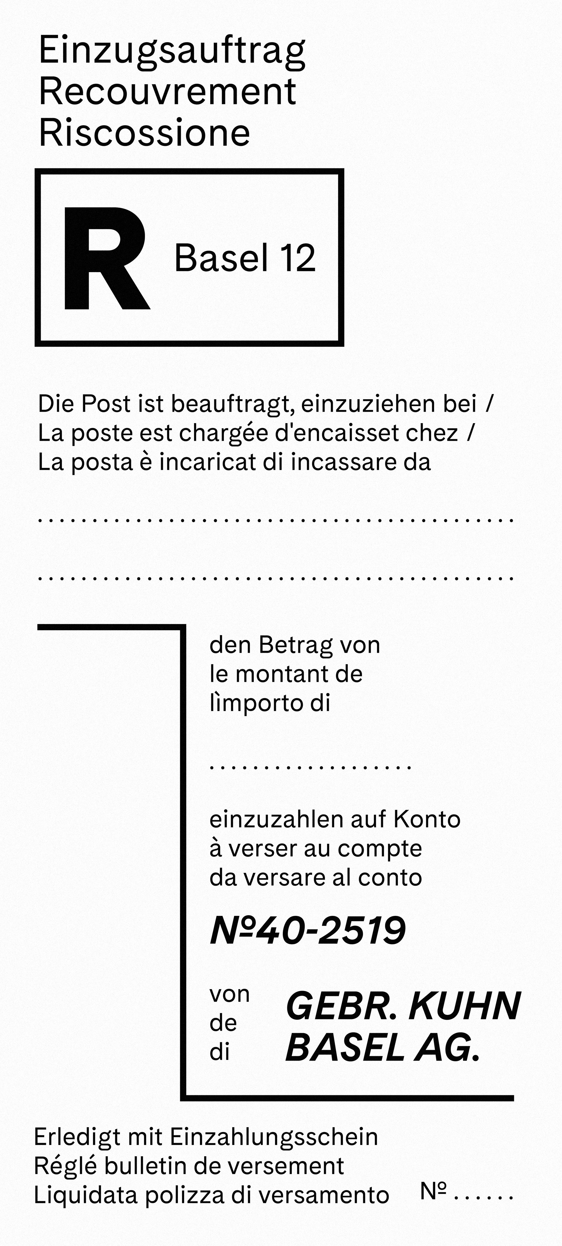
Derived from a film-setting font used in the magazine Du from 1960s, Cádiz is an elegant and space-efficient typeface that beautifully incorporates the distinctive elements of early 20th-century typography. It captures the timeless charm and aesthetics prevalent during that era with meticulous attention to detail.

The typeface is available as individual weights and as a variable font with a Light → Black axis. The family package includes two variable fonts: upright and italic.

Pizzo di Madéi 2551 m s.l.m.
Risotto indivia fiori di zucca grupo interserviços de apoio The end justifies the means Fair exchange is no robbery Air contains 20.9% Oxygen Scientific study of the mind Luminous stellar explosion Practice what you preach sophisticated Technology Abbacchio alla Cacciatora Schesaplana, 2964 m ü. M. représentèrent ce parfum
Los Pirineos son más antiguos que los Alpes: sus sedimentos se depositaron por primera vez en las cuencas costeras durante las eras Paleozoica y Mesozoica. Hace entre 100 y 150 millones de años, durante el período Cretácico Inferior, el golfo de Vizcaya se desplegó, empujando a la España actual contra Francia y aplicando una intensa presión de compresión a grandes capas de roca sedimentaria. La intensa presión y la elevación de la corteza terrestre afectaron primero a la parte oriental y se movieron progresivamente a toda la cadena, culminando en la Época del Eoceno. La parte oriental de los Pirineos se compone principalmente de rocas de granito y gneiss, mientras que en la parte occidental los picos de granito están flanqueados por capas de piedra caliza. El carácter masivo y sin uso de la cordillera proviene de su abundancia de granito, que es resistente a la erosión.
The International Typographic Style has had a profound influence on graphic design as a part of the modernist movement, affecting many design-related fields; including architecture and art. It emphasises cleanness, readability, and objectivity. Hallmarks of the style are asymmetric layouts, use of a grid, sans-serif typefaces and flush left, ragged right text. The style is also associated with a preference for photography in place of illustrations or drawings. Many of the early International Typographic Style works featured typography as a primary design element besides its use in text, and it is for this that the style is named. The style emerged from a desire to represent information objectively, free from the influence of associated meaning. The International Typographic Style evolved as a modernist graphic movement that sought to convey messages clearly and in a universal manner. 
Wie auf dem festen Land, so gibt es auch im Meer, Erhöhungen und Schluchten. Viele Berge unter dem Meer sind höher, manche Gebirgszüge sind länger, viele Schluchten tiefer als irgendwo auf dem Festen. Wenn man den höchsten Berg mit seinen 8847 Metern Höhe, in die tiefste Tiefe versenken wollte, so würden immer noch gut 2186 Meter Wassertiefe über seinem Gipfel liegen. Während aber alle Erhebungen auf dem festen Land dem ständigen, zermürbenden Angriff von Erosion ausgesetzt sind, stehen die Gebirge unterm Meer unversehrt im stillen Wasser der Abgründe. Lediglich ihre obersten Spitzen, die durch das Wasser durchstoßen und uns als Inseln erscheinen, werden vom Wind, von der Brandung und vom Regen angegriffen. Der Meeresboden ist in drei Abschnitte unterteilt : den Kontinental-Schelf, den Kontinental-Abfall und den Tiefseeboden.
Light
Light Italic
Book
Book Italic
Regular
Regular Italic
SemiBold
SemiBold Italic
Bold
Bold Italic
Black
Black Italic

Formats

Desktop: otf (PS)
Variable Desktop: TTF-Variable-Font
Web: woff / woff2  /
Web Variable: woff / woff2 
App: otf (PS) / TTF-Variable-Font
Variable App: TTF-Variable-Font

Language Support

Basic Latin, Latin-1 Supplement and Latin Extended-A.

Afaan Oromo Bemba Bosnian Catalan Croatian Czech Danish Dutch English Estonian Filipino Finnish French German Hungarian Indonesian Irish Italian Ilocano Javanese lat. Kurdish lat. Latvian Lithuanian Malay Norwegian Polish Portuguese Quechua Romanian Romansh Slovak Slovenian Spanish Swahili Swedish Tagalog Turkish Wolof Zulu

..see the complete list here!


Download PDF Samples of the Fonts! Spezimen
Download test Fonts and give it a go! Test
Purchase a Desktop Web or App Licence! Buy
A
A U+0041
Alternate Glyphs
WgZQ WgZQ
Ligatrues
Sofia Sofia
Contextual Alternates
Eggy Eggy
(Default) Proportional Lining Figures
$1024
Tabular Lining Figures
$1024 $124
Superscript
m3
Ordinals
5a5o 5ª5º
Fractions
15 ⁄ 32 15⁄32
Numerators and Denominators
2H5 2H5
Cadiz Font Luzi Type Foundry
Luzi Type

Featured in our notes: The design duo Look Here Design crafted the internet appearance of the American Illustrators Gallery.

Cádiz Font Luzi Type Foundry

Featured in our notes: The Stockholm based studio Bedow used Cádiz for filmmaker duo Terri Timely and there the visual identity.

Cádiz Font Luzi Type Foundry

Featured in our notes: Amrhein Anderhalden, the office for Design and conception, did design the identity of Küng Holzbau.